Where do you get your inspiration? This blog started with a single tile that caught my eye on the work table in the showroom.
 |
| KJ Patterson deco in Ivory, Persian and Rust |
Something about this combination of colors really clicked for me. So, I went off to see if
Pratt & Larson made colors like this too.
We do! C23, C72 and C35 are great craftsman matte glazes with a very similar feeling to the tile from KJ Patterson. Any one of them would be a great field choice to go with this deco. Actually there are a number of vendors with similar glaze colors, and each one brings their own look to the palette.
Seneca Tile Motawi Tileworks
But of course, you aren't limited to ceramic tile. You could completely change the look and use these colors in a totally different material, like this sleek glass tile from the
Chiaro series by Grid.
The bright light blue seems closer to the original tile color but I think I like this darker shade of blue a bit more.
Having spend so much time looking at these colors, I'm suddenly seeing them everywhere!
Passing through the factory I noticed these circles:
 |
| P&L 3/4" dots |
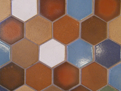
and then there are these hexes on the showroom floor:
and then i came across this bedroom picture on line:
So many ways to interpret a single tile or color combination. When something catches your eye you can use it as a jumping off point to start your project, even if it's not strictly related to the project at hand. A pretty tile might help you pick the paint colors for your bedroom. A favorite dress might help you decide the colors for your bathroom remodel. Bring in all your inspiration when you come visit our showroom, spread it out on a worktable and let's see where it takes you.


great post; inspiration can come from the smallest of things!
ReplyDelete